The right granularity of data
Since JobNet Visual is designed to visualize nightly batch processings it uses a granularity of minutes to display data. In the chart, each minute is represented by a colored block with a width of one pixel. Thus, any runtimes below one minute will be rounded up to a full minute as the basic unit. Using input data based on a lower granularity (e.g. seconds) is currently not supported. Also, even though JobNet Visual will basically be able to render a chart for higher granularities like hours or days, it is (at the moment) not recommended for such data and might produce incorrect or strange looking results.
Prepare your data
Required Fields
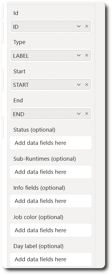
The JobNet Visual requires a data set consisting of a minimum of four columns, where each row represents one execution information for a job instance.
Required columns:
- ID (String): a unique identifier of a job instance, such as a job or execution id.
- TYPE (String): a string label for a job type, such as a job or process name
- START (DateTime): date and time the job started
- END (DateTime): date and time the job ended
The overall runtime in minutes will automatically be calculated from the START and END date, so the report creator must ensure that the input data is valid and that START is smaller than END for all rows.
Optional Fields
- STATUS (Character): a single character to indicate the three valid status values:
- “C”: Job completed
- “W”: Job has warnings
- “E”: Job has error
- SUB RUNTIMES (Integer): a list of up to four input columns containing sub runtimes in full minutes. Each sub runtime will be represented in the visual using a different type of shading pattern. Please note that the report creator must ensure that the sub runtimes are valid, i.e. that they are not greater than the overall runtime of a job.
- INFO FIELD (String): a list of up to ten custom fields with additional information regarding a job. An info field gets added to the tooltip popup when hovering over a job box. It is recommended to not use large strings so that the tooltip remains readable. An additional information for a job might be, for example, a detailed error string, since the STATUS field will only hold the status code (which is “E” in this case).
- JOB COLOR (String): I you want to use your own colors for specific job types then just include the desired color as a hex value in your input data set (e.g. “#454545”). While parsing the input data, JobNet Visual will register each new job type and its color value to be used in the visual. Since every job type gets registered only once, the first combination of job type and color found in the input data set will be used. This means that even if you have – by mistake – set multiple color values for the same job type, the visualization will work since only the first occurrence for each job type is relevant.
- DAY LABEL (String): The timeline in the header of the visual displays a date string above the hours (e.g. “2025-02-05”). The DAY LABEL field can be used to display additional information next to the date string, such as weekday information (“Mon”, “Tue”, “Wed”, …) or business specific calendar-related milestone tags (“Closing Date – 3”). The input column containing the day label will be related to the START column in the same row, i.e. the DATE part of the START column will be suffixed with the DAY LABEL when displaying the date string in the timeline.
Like with JOB COLOR the first combination of date and DAY LABEL found in the input data set will be used.
Example input data set
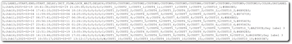
- Job type “Job9” with ID 1 will use custom color #DB43B5 for visualization
- Job type “Job12” with ID 7 will use custom color #A250CE for visualization. Additionally, DAY LABEL “Day label 3” will be added to the date “2025-02-20” in the timeline.
Download the example data set:
A sample Power BI report including this data set can be downloaded from JobNet Visual page in the Microsoft AppStore.